AAPI Creatives & Entrepreneurs (ACE)
Graphic design, branding
The branding of ACE, a collective that brings together AAPI creatives and small businesses to amplify their voices and impact.

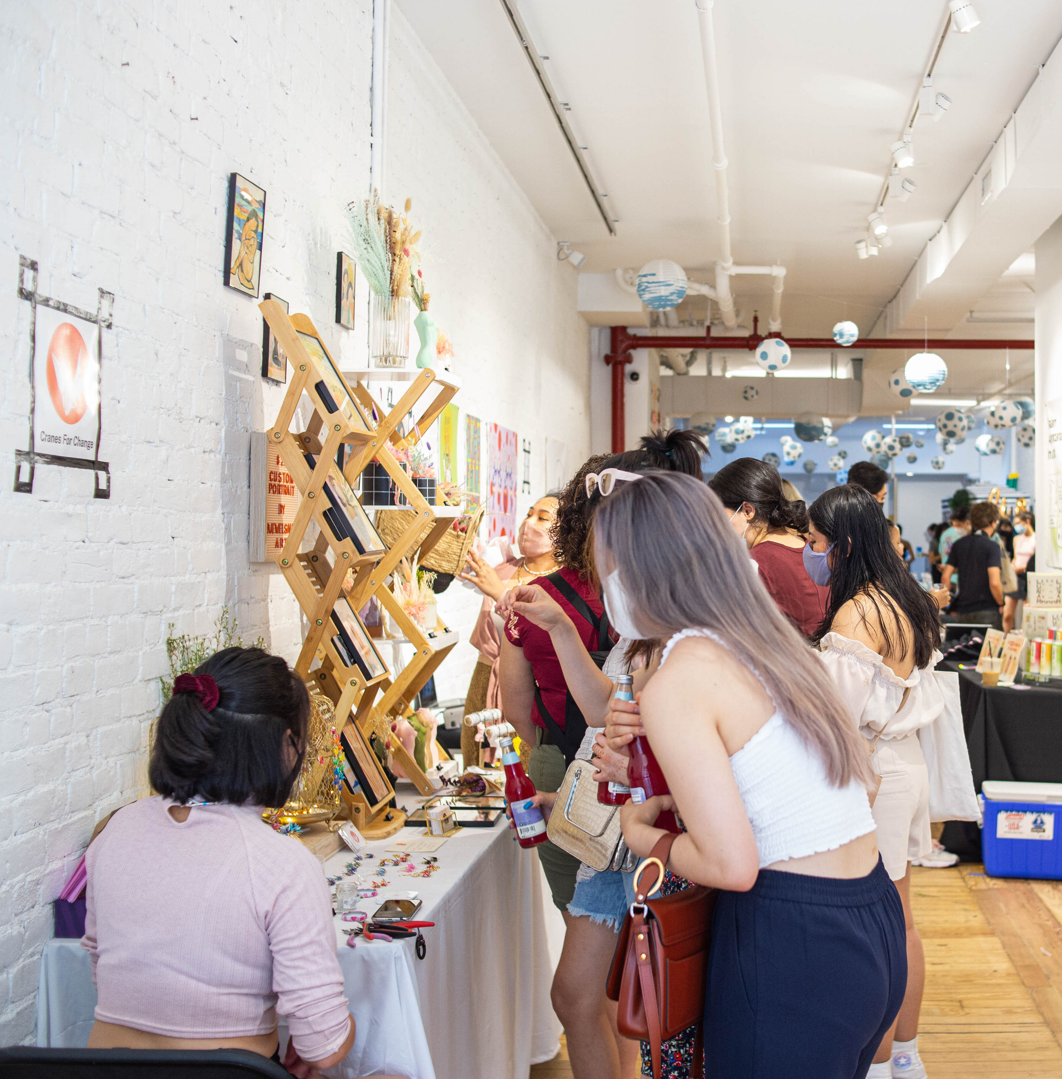
JUNE 2021 ACE’S FIRST POP UP
About the Project
AAPI Creatives & Entrepreneurs (ACE) is a collective whose goal is to bring together creative and entrepreneurial AAPI into a community. In less than a year of its formation, ACE has hosted 2 pop-ups with over 60 AAPI small businesses and 3,000 attendants.
As part of ACE, I am a co-founder and member of the creative team. I created ACE’s logo and branding system in Illustrator, and I continue to help on the creative team which helps with creating the ACE brand experience and decorating for the pop ups.

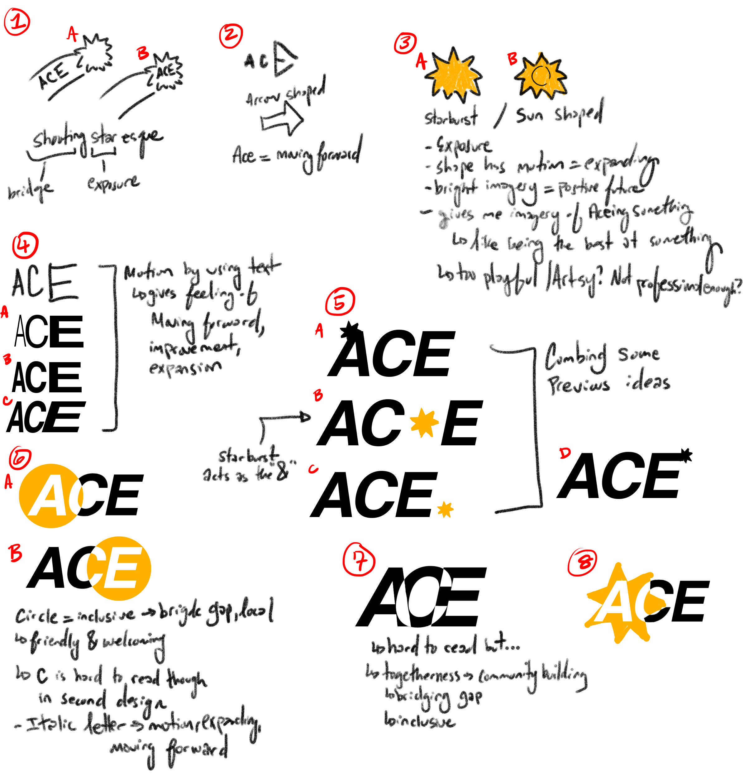
BRAINSTORMING ACE LOGOS
Branding Brainstorming
From ACE’s mission, I picked out keywords and phrases I wanted to be represented in the branding which included bridge the gap, expanding AAPI businesses, local creatives, and exposure.
From there, I created designs that would symbolize those key ideas. I used arrows and starbursts to signify moving forward and growing, and I also used circles to represent unity and togetherness. I also played around with increasing type size and overlapping size.
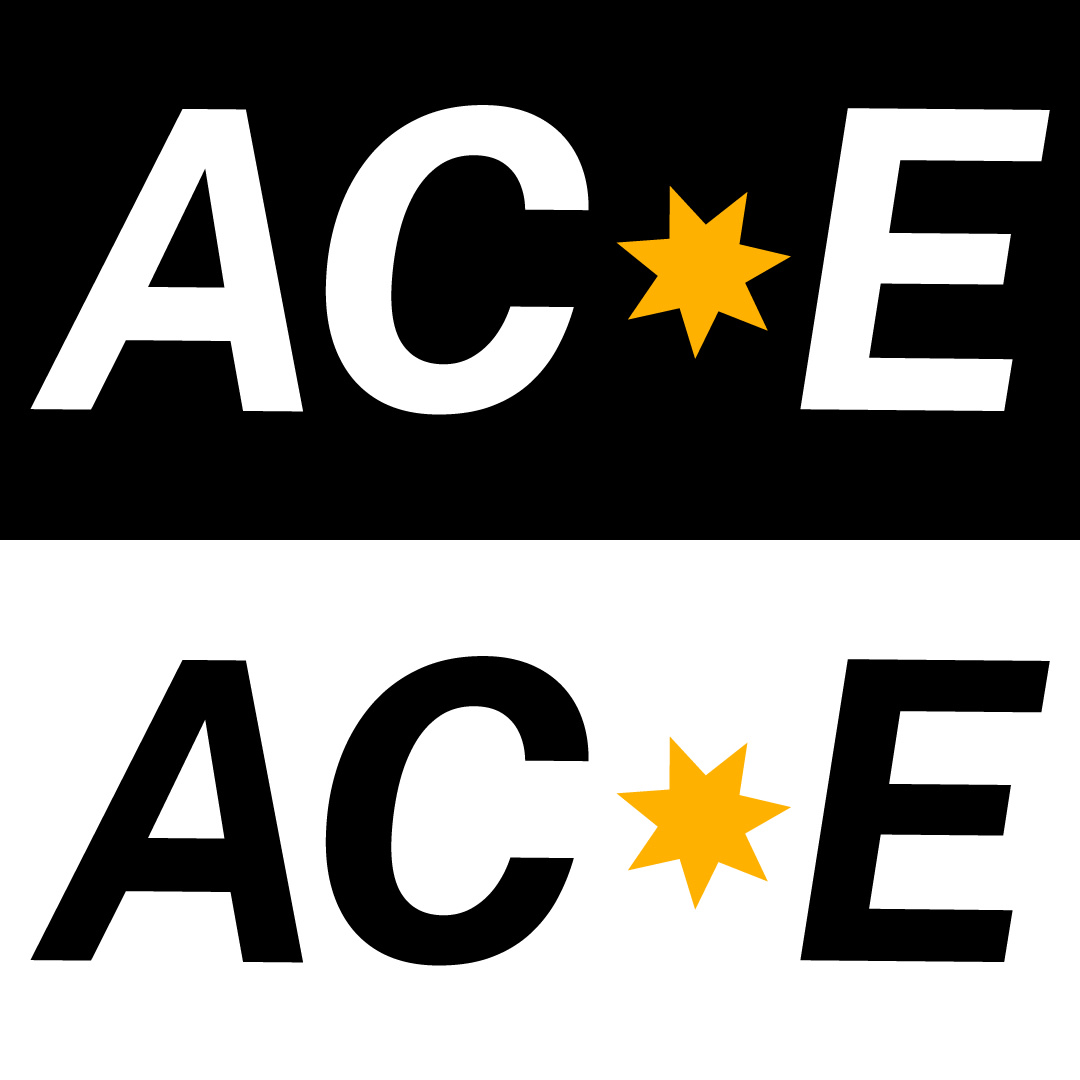
FINAL ACE LOGO
Final Branding Decisions
The final logo for ACE uses a yellow seven-pointed star in between the letters of AC and E. The star acts as the “and” in AAPI Creatives and Entrepreneurs. The star shape has a bright imagery that represents exposure and a positive future through ACE. The shape also has a lot of motion, looking like it will expand the same way ACE hopes to grow the AAPI creative community. ACE’s main color is yellow because of the colors positive and bright connotation.
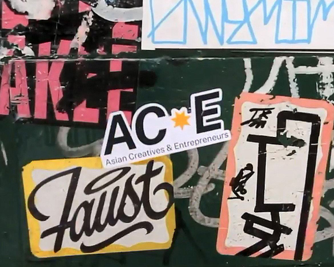
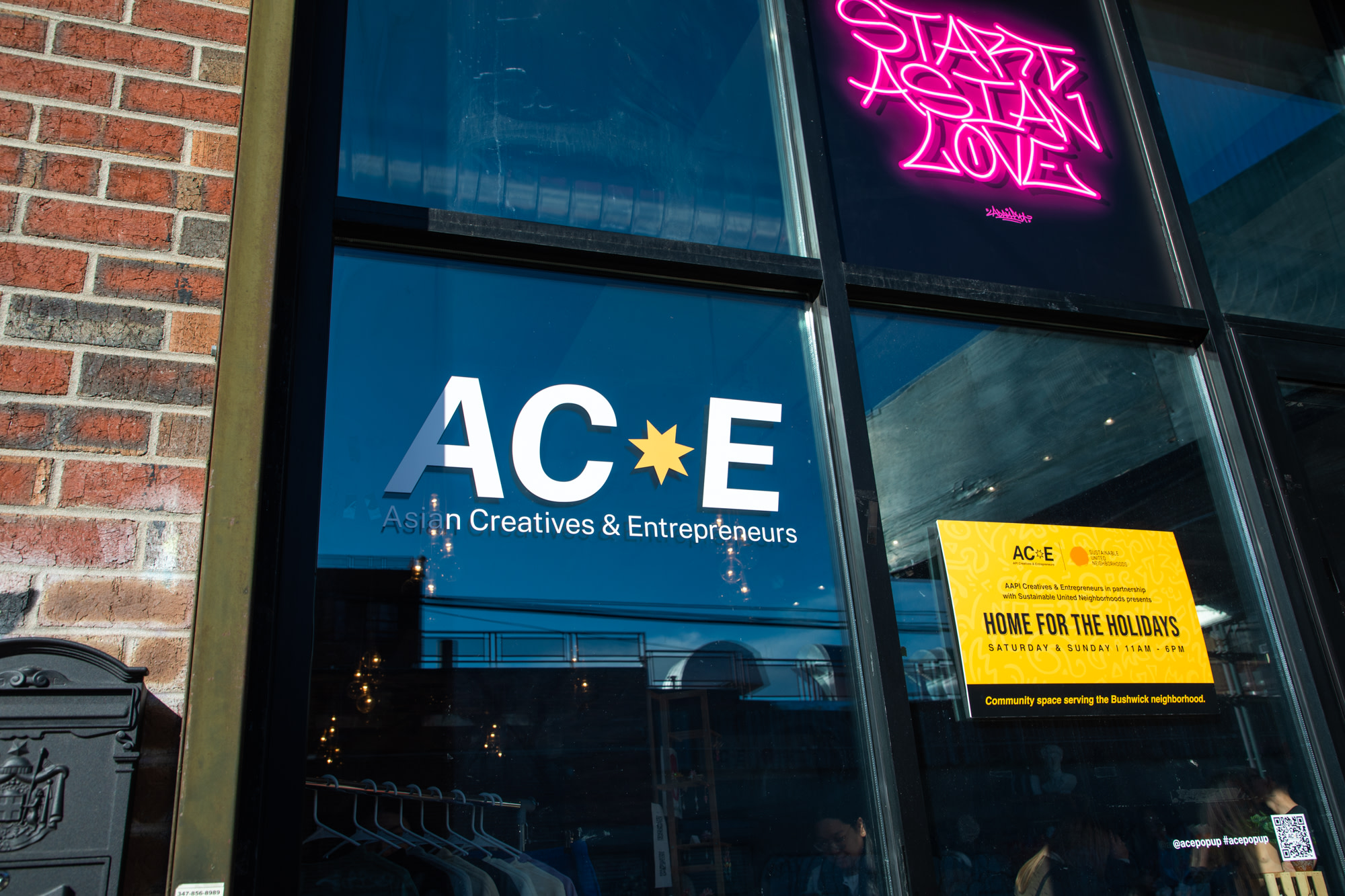
ACE LOGO IN ACTION
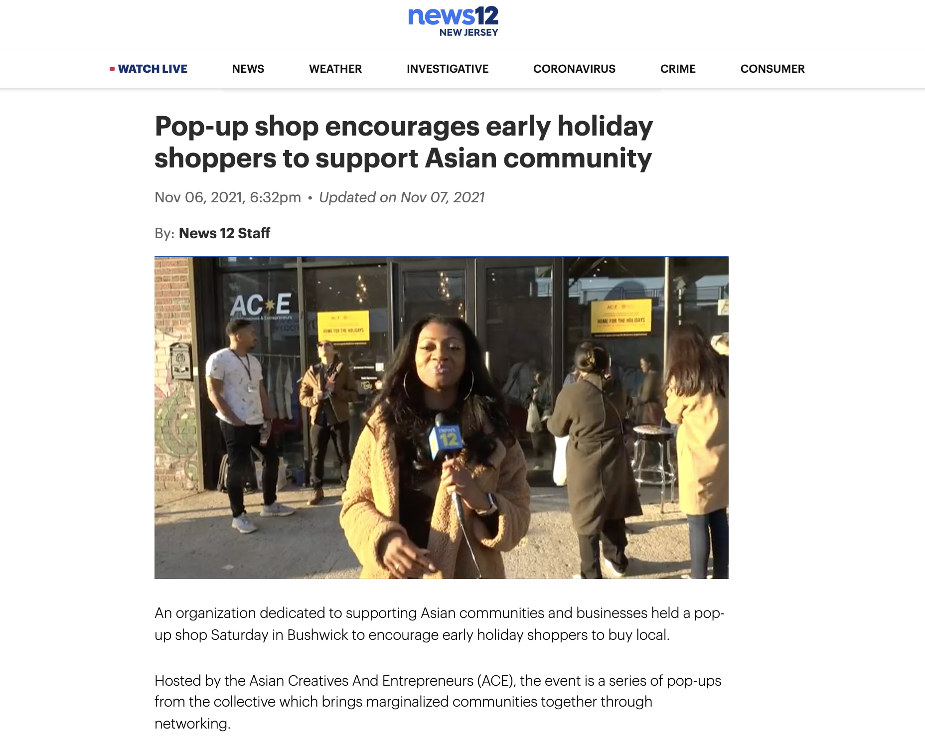
ACE ON NEWS 12