Padio
Graphic design, branding, UI/UX
A clickable visual prototype for Padio, an imaginary community podcast website, made with Zoe Wells.


CREATIVE JAM PROMPT & INITIAL BRAINSTORMING FOR CONCEPT
About the Project
Padio (combining pod and radio) is an imagined podcast platform for connecting podcast creators and their communities. This idea was inspired by the prompt (pictured above) from the Twitch and Adobe Creative Jam. This prototype was made by me with Zoe Wells .
I made the logo in Illustrator and came up with the visual branding while Zoe worked on the wireframes. Together we worked on creating an interactive prototype in Adobe XD which included interactive elements by me.

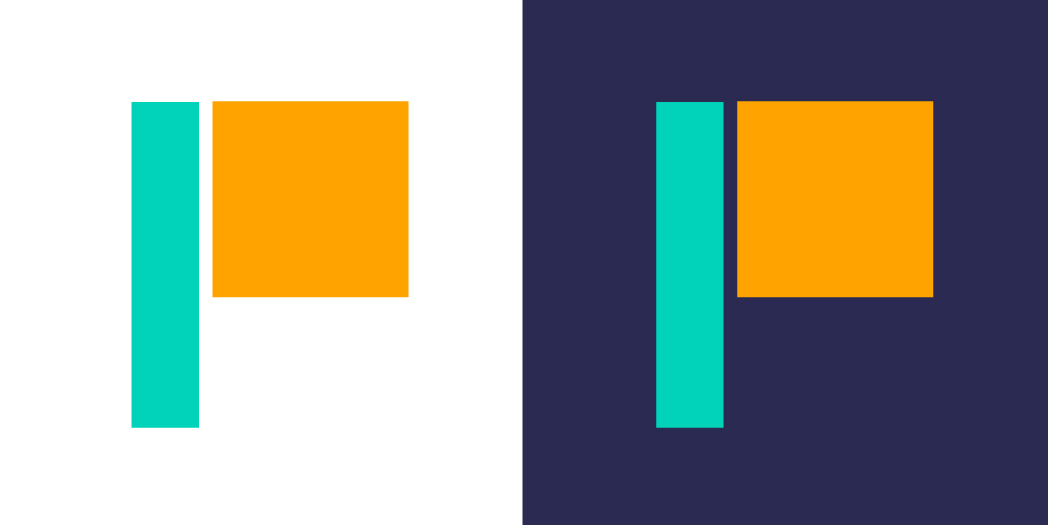
PADIO BRANDING BRAINSTORM AND FINAL LOGO BY ME
Branding Decisions
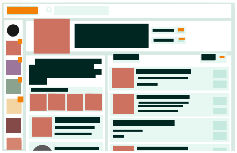
Padio is about forming communities, so we wanted the visual branding to reflect that. We chose teal and orange as the main colors because they are bold yet friendly. In Illustrator, we made a logo using rectangular shapes to make the letter P to keep the logo simple and organized. The geometric branding is also meant to look like a patio space, after the platform's name, as patios are a place for people to hang out and enjoy each other's company.
For the font, we chose Europa for its circular shapes. The rounded letters are soft and inviting, and it contrasts well with the many rectangular elements in Padio's design. Also, the typeface is very clean and simple which matches the rest of our branding.
This part of the project was mainly done by me.
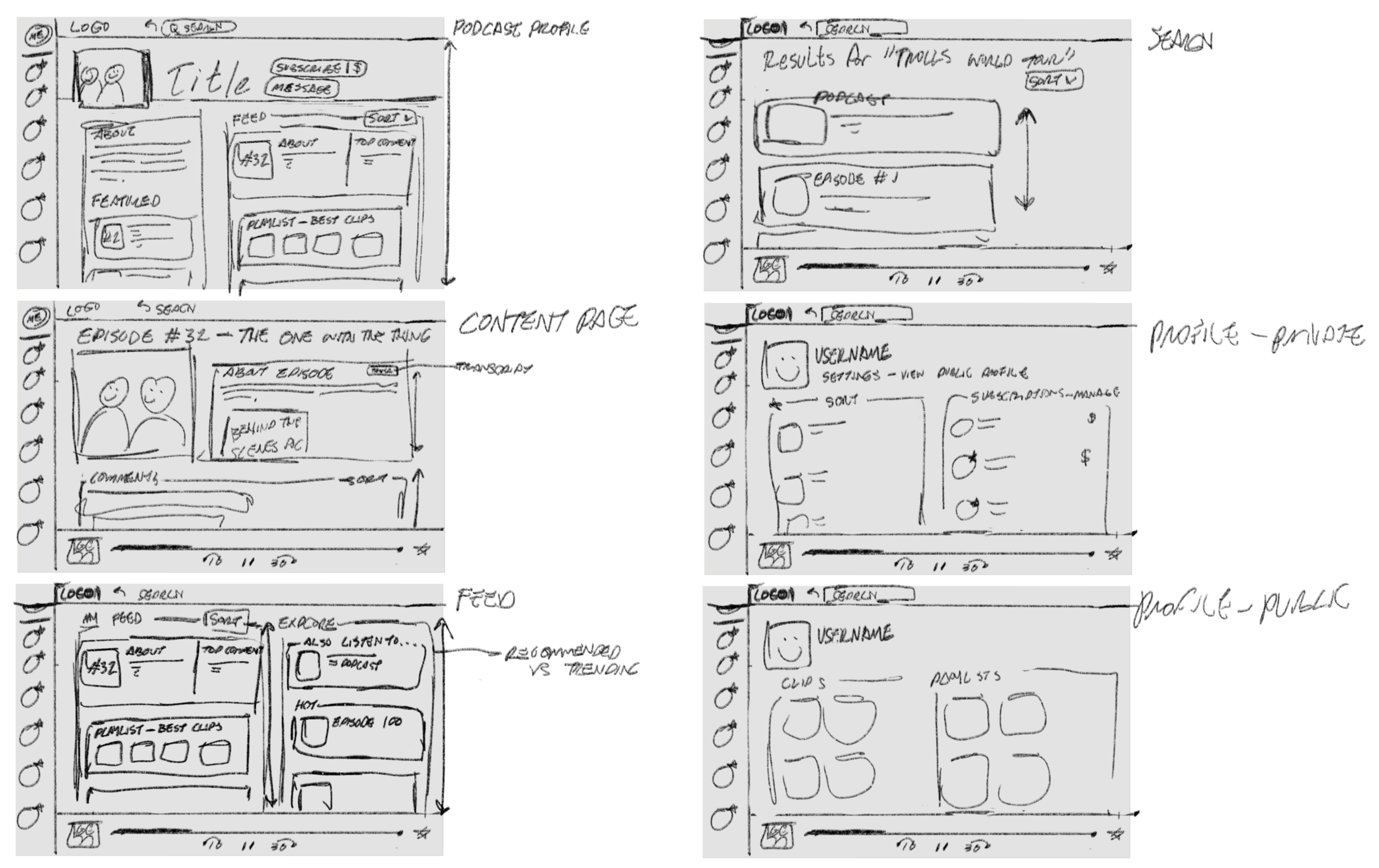
WIREFRAMES BY ZOE
User Interface
For the user interface, we knew organization would be important because of the variety of content on Padio. We used fixed navigation bars on the top and right for the essentials, such as home page, searching, personal profile, and followed podcasts. We also have a fixed bottom player if there is a podcast being played. The rest of the content is organized into clearly defined scrollable sections, such as podcast episodes, clips, playlists, and comments.
Zoe came up with most of the UI, and we both laid it out in Adobe XD, working on the UX together.

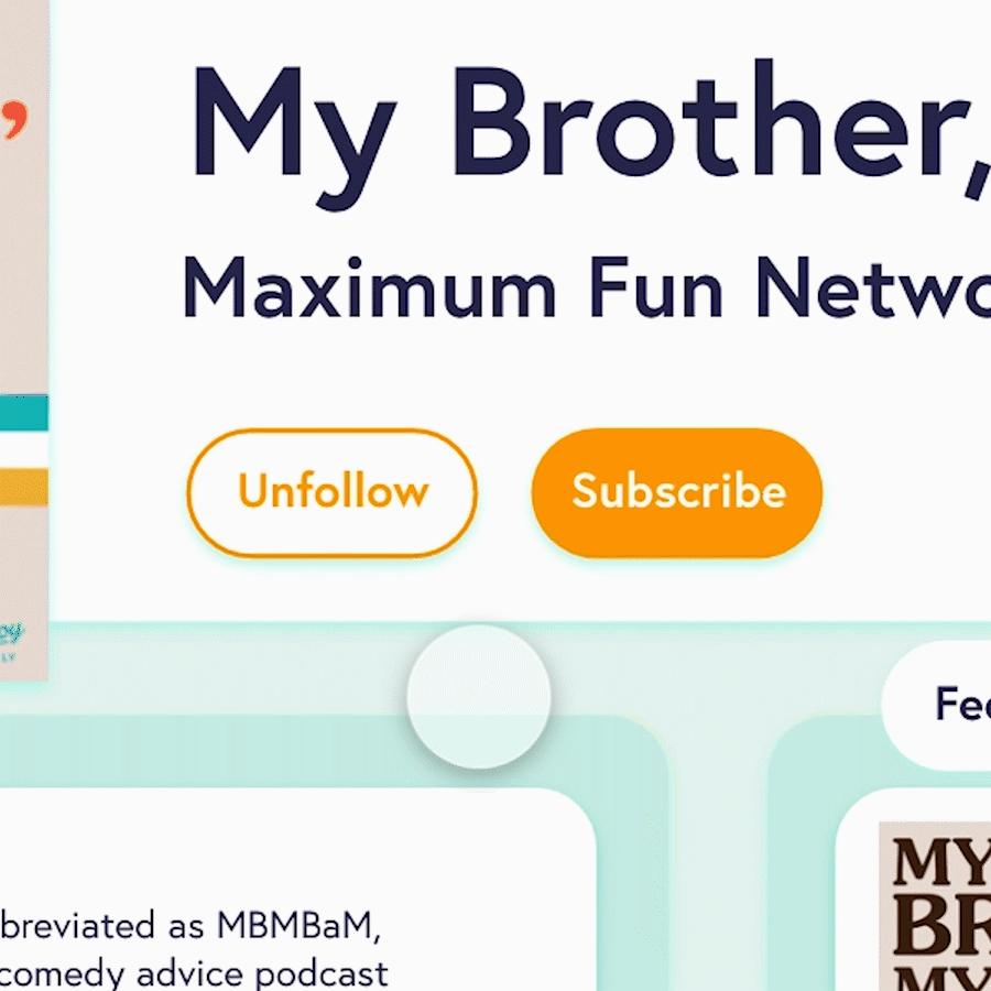
DROP DOWN MENU HOVER ANIMATION AND BUTTON HOVER ANIMATION BY ME
Interactive Elements
Most of the buttons in the prototype are animated. When a user hovers over them, a drop down menu will appear or the colors will change.
The button interactions were all done by me.